
Steps Together
A calming, grounded identity, and a stronger digital experience behind it.
Steps Together is a multi-speciality UK addiction and mental-health group. Its brand already had a clear, calming character; what it needed was a system, consistent color and type, and a digital experience that lived up to the care.
Addiction Marketing Agency reviewed and strengthened the brand system, proposed a unified type direction shared with sister brand Rainford Hall, and ran a full UX/UI and development audit of the site.

The Steps Together wordmark and its rhythm, “reset · reframe · recover”, the heart of the brand.
Grounded, balanced, calm
The identity is built on a calming, balanced palette, deep green, earthy olive and soft grey, that gives the brand a sense of stability, care and calm across digital and print. Typographically it runs on ITC Avant Garde Gothic Pro, a modernist geometric face whose precision keeps the tone clean and approachable. We kept that foundation and gave it a documented, consistent system.
Specimen shown in a geometric web stand-in; the brand font is ITC Avant Garde Gothic Pro.
Making the site match the care
Alongside the brand work we audited the live experience end to end, navigation clarity, mobile usability and thumb-reach, image quality, content structure and page performance, and set clear, prioritised fixes. Small, deliberate changes to hierarchy, contrast and layout make the site easier to use and more credible, so the digital experience finally matches the quality of the treatment.
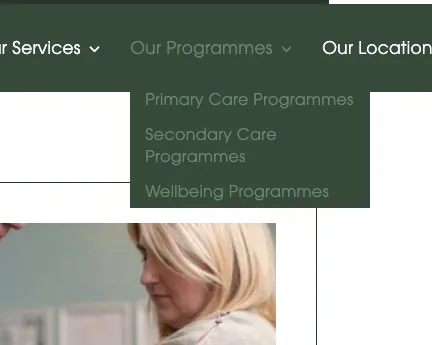
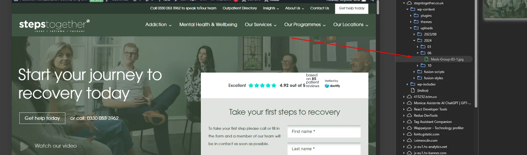
A consistent brand, a better experience
Steps Together came away with a documented brand system, a unified type direction shared with Rainford Hall, and a clear roadmap of UX, UI and development fixes, the groundwork for a digital presence as considered as its care.
Rainford Hall
Heritage, warmth and elegance, the premium sister brand in the Steps Together family.
View case study →
Brand looks right but the site lets it down?
We align brand and digital so the experience matches the care, from identity system to UX to build. Start with a free brand and web review.
Start a branding conversation →