
Rainford Hall
Heritage, warmth and elegance for a premium recovery setting.
Rainford Hall is the premium residential clinic in the Steps Together family. Its brand has to convey something different from its sister centers, refinement, tradition and a serene, elevated atmosphere, without ever losing warmth.
Addiction Marketing Agency documented and strengthened the Rainford Hall brand system, an elegant color and type pairing, and reviewed the digital experience so the website carries the same premium feel.

The Rainford Hall wordmark, a refined serif in warm gold, part of the Steps Together group, distinct in feel.
Richness and softness, in balance
The palette pairs a deep teal for calm, depth and trust with a warm gold for refinement and tradition, held on soft cream and white for readability and a clean, premium aesthetic. It is deliberately richer than its sister brands, signaling the elevated Rainford experience at a glance.
Typography does the same work: Adobe Garamond Pro headlines add classic, editorial elegance, while ITC Avant Garde Gothic Pro body keeps everything clear and contemporary. The pairing lets Rainford sound sophisticated and stay accessible, consistently, across print and digital.
Specimens shown in close web stand-ins; the brand fonts are Adobe Garamond Pro and ITC Avant Garde Gothic Pro.
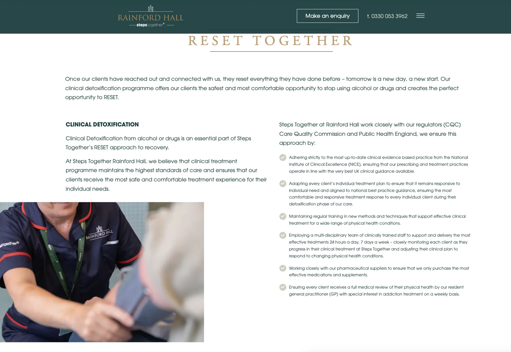
A premium feel, on every page
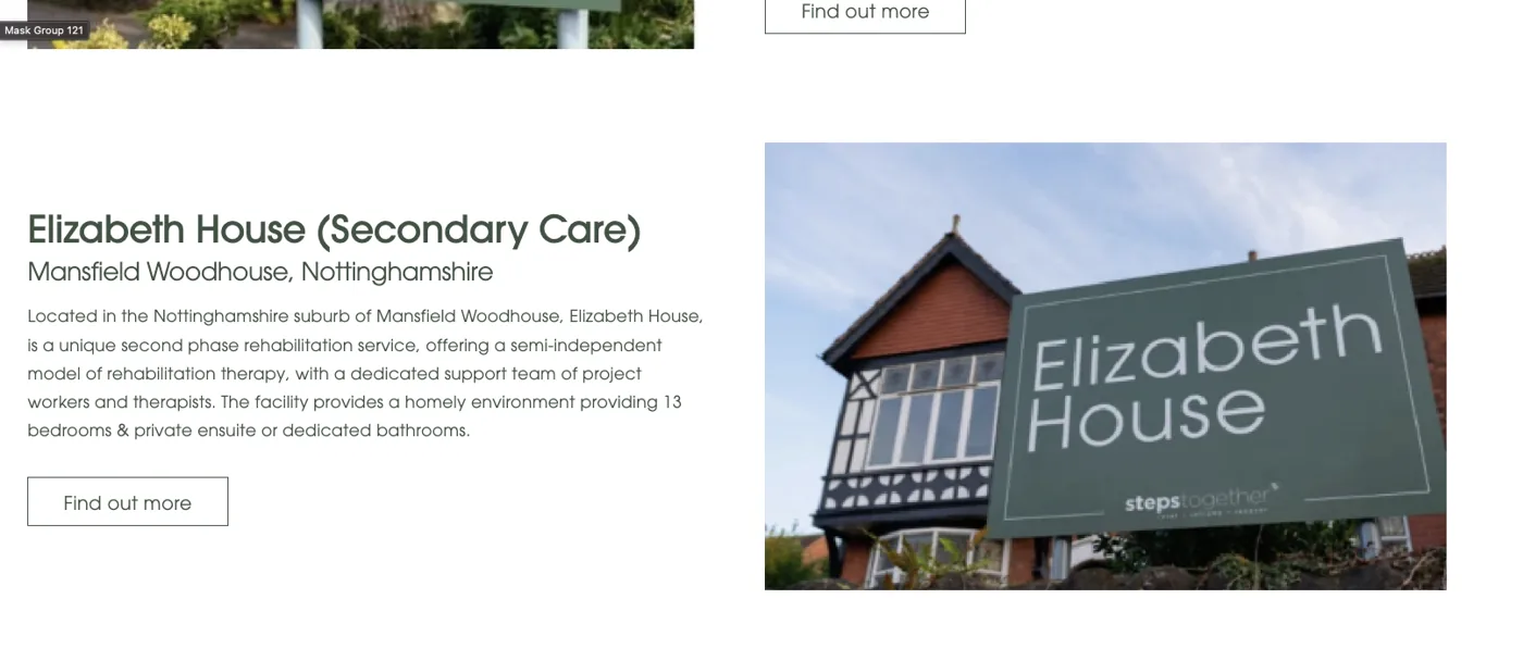
We reviewed the live site against the brand, navigation, layout, imagery and hierarchy, to make sure the digital experience reads as refined as the setting. Considered spacing, clear visual hierarchy and a clean burger-menu navigation keep the interface uncluttered and unmistakably premium.
A premium brand, made consistent
Rainford Hall came away with a documented, elegant brand system, deep teal and warm gold, Garamond and Avant Garde, aligned with the wider Steps Together family, and a clear view of the digital changes that keep the website as refined as the experience it represents.
Sierra Recovery
A peacock-inspired identity for a residential rehab in the mountains of Andalucía.
View case study →
Positioning a premium tier?
We build elevated brand systems that stand apart while staying part of the family, and make sure the website carries the feeling through. Let’s talk.
Start a branding conversation →