
Sierra Recovery
A serene mountain identity, grown from the peacocks that roam the estate.
Sierra Recovery is a residential addiction and mental-health clinic set in a working cortijo in the hills above Humilladero, Málaga, minutes from the limestone formations of El Torcal. It exists to give people complete disconnection from the outside world and a chance to reconnect with what matters, in nature.
Addiction Marketing Agency created the brand from the ground up: the concept, the peacock-derived symbol, the logotype and lockups, the typography, the color system and the look and feel that carries through to the website.
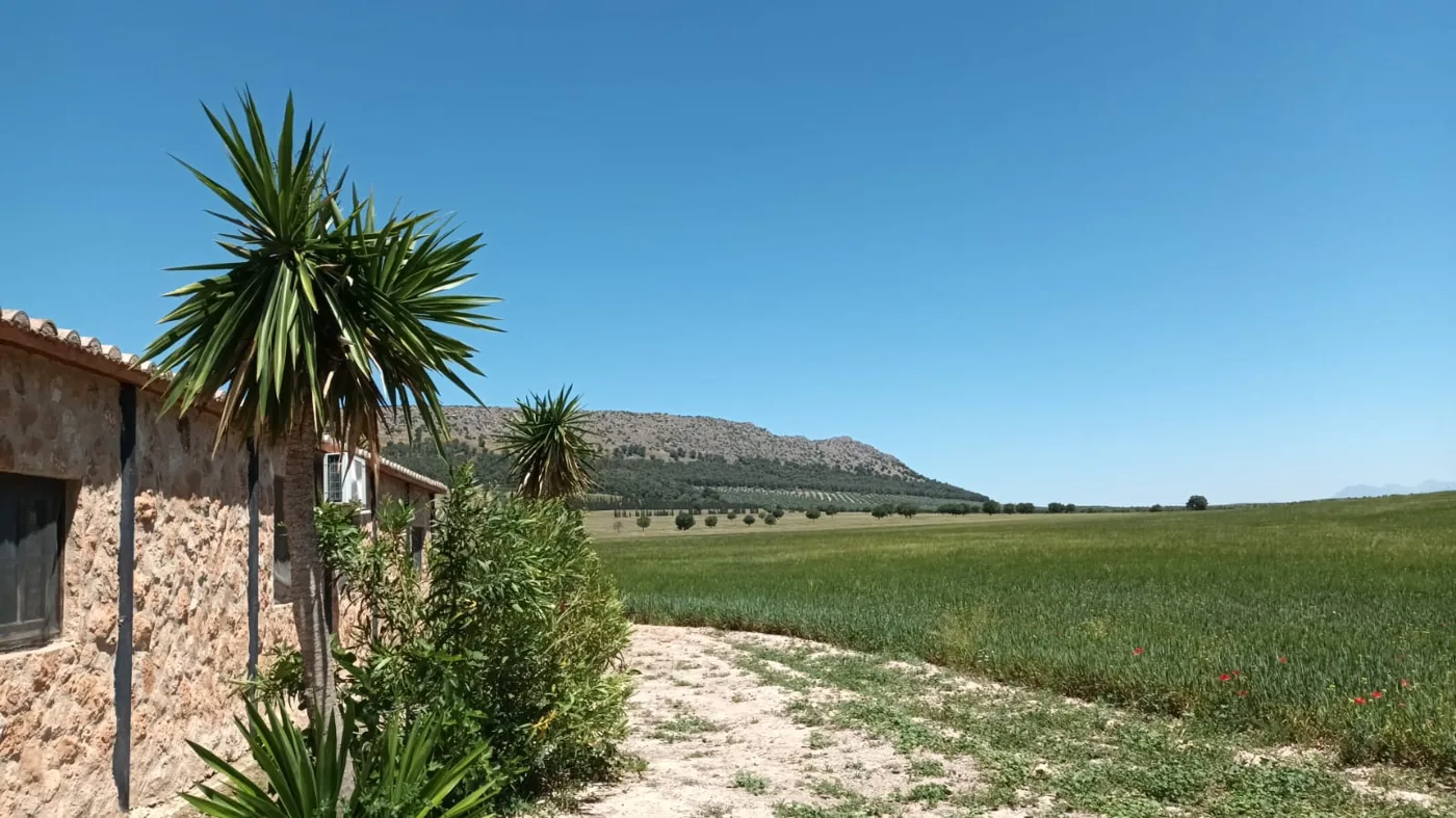
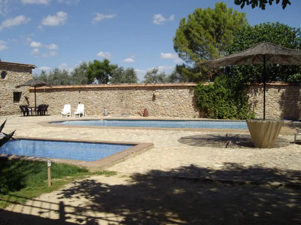
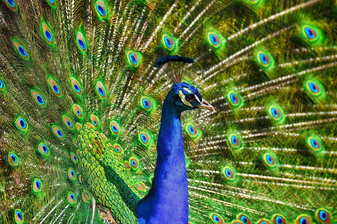
The setting did the briefing: rustic Andalucía, the Sierra, and the peacocks and horses that live on the estate.
Let the place speak
Before a single shape was drawn, we grounded the brand in the estate itself. Sierra Recovery is not a clinic on a high street; it is a rustic retreat in the mountains of southern Andalucía, built for complete disconnection in a serene environment. The strategy was to make the identity feel like the land, calm, natural and dignified, rather than clinical or corporate.
We distilled the discovery into a tight set of brand anchors: nature, retreat, idyllic environment, nature connection, the peacock, the Torcal, rustic warmth and earth tones. Every later decision, symbol, color and typeface, had to trace back to one of them. That gave the brand a single, coherent voice: quietly confident, warm, and never boastful.
Symbols of harmony and growth
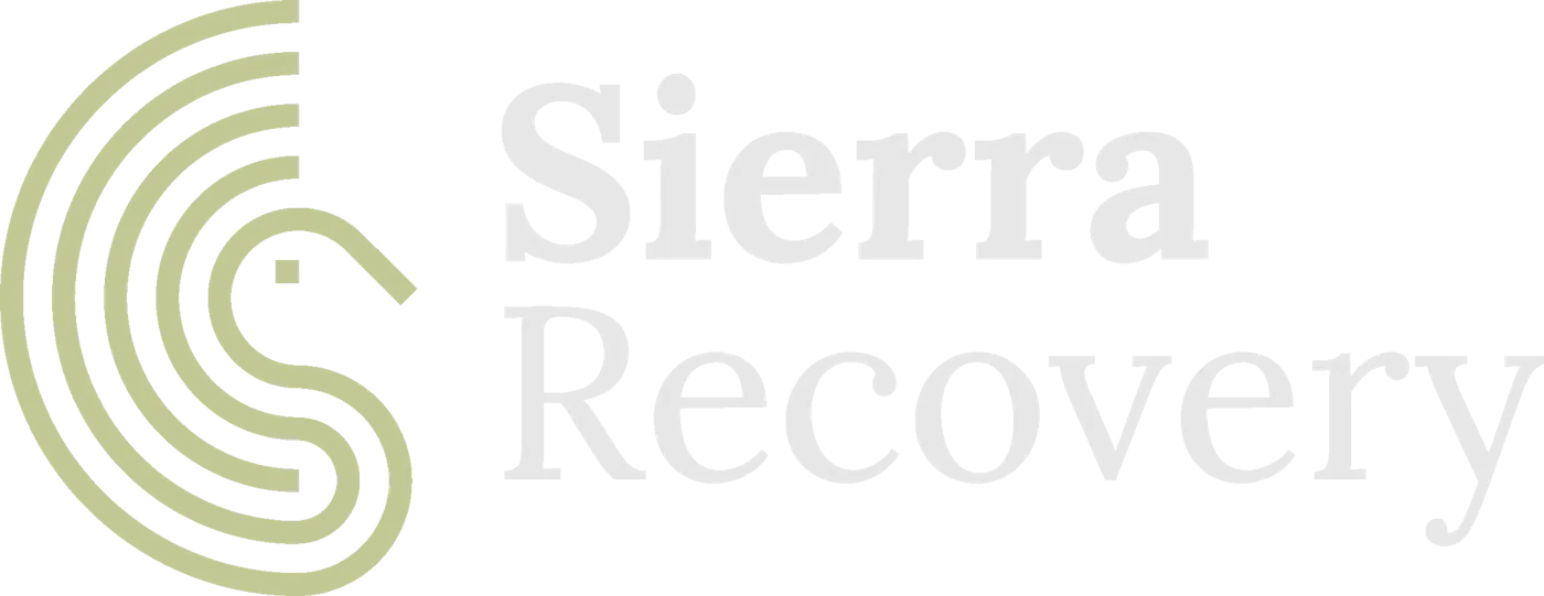
The mark distils nature and serenity into one form. Drawing on the majestic peacock of the estate, we built the symbol from concentric circles that form the peacock’s expanding tail, a shape that reads at once as feathers fanning open and as ripples of growth. It evokes the elegance of the bird and the harmony found throughout the retreat, and it resolves into a clean, ownable “S”.


Left: the finished emblem. Right: the concentric-circle construction, the peacock’s tail expanding outward.
One system, many surfaces
The emblem locks up with a warm, humanist logotype to work across signage, print, digital and social, in positive, reversed and single-color treatments, each with defined safe area and minimum sizes.

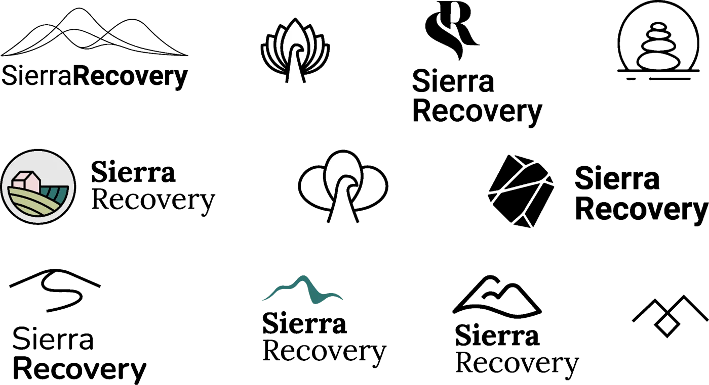
The primary lockup plus colourway and emblem variants, and a small icon set drawn in the same geometric language.
Andalusian earth tones
The palette is taken straight from the landscape: soft mist grey, a blush clay, an olive sage from the groves, and the peacock’s own deep teal, anchored by ink black. Calming and grounded, it embodies the purity and tranquility of the surrounding hills.
Type that connects with nature
We paired Nunito, a soft, modern sans, with Lora, a classic literary serif. Together they balance simplicity with warmth, exactly the tone of a rustic retreat that is also a serious clinic.
A visual identity where concentric circles form the peacock’s tail, an invitation to disconnect from the outside world and reconnect with what truly matters.Sierra Recovery brand concept, Addiction Marketing Agency
The brand, in motion
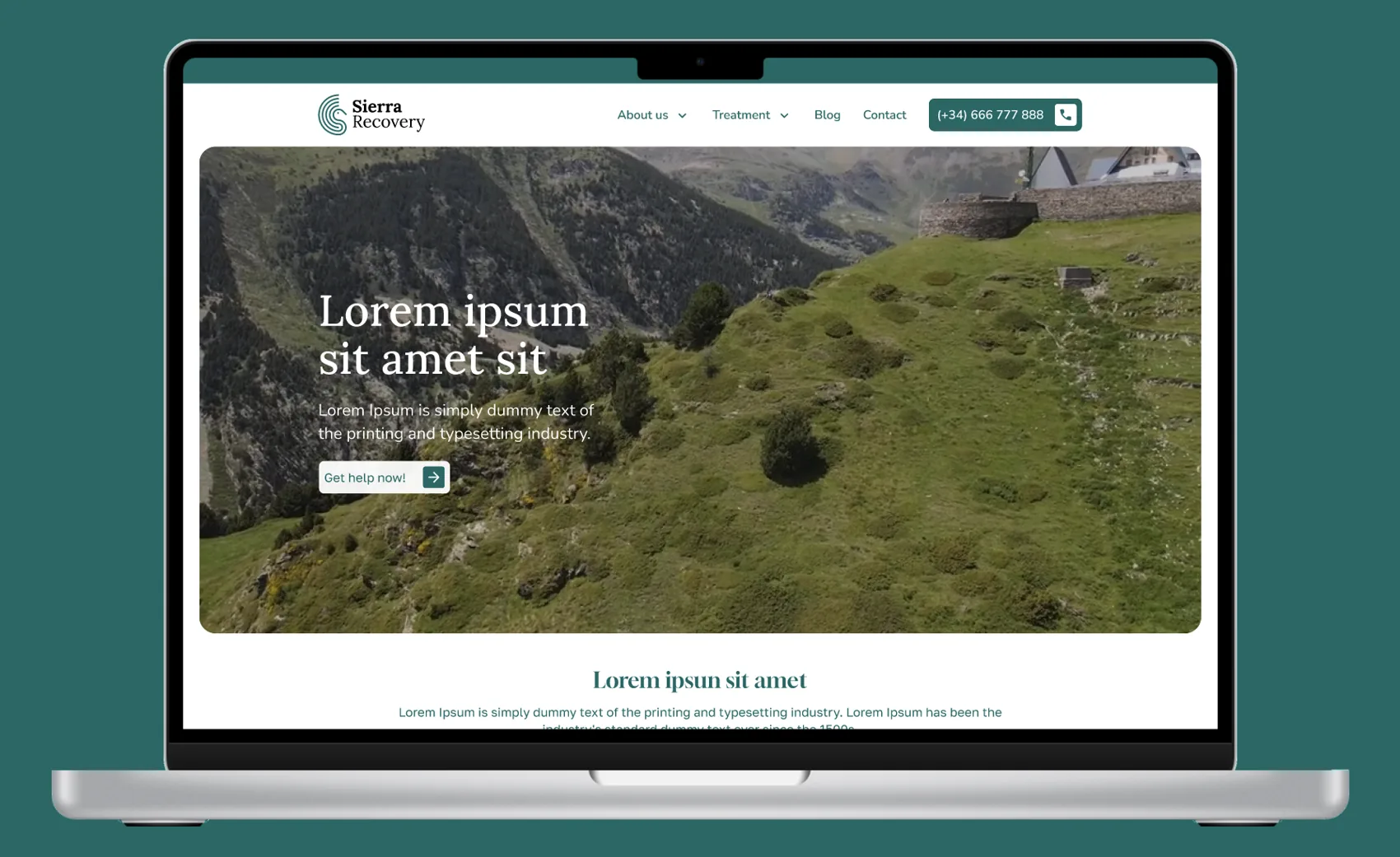
The identity carries straight into the website: earthy imagery of the Sierra, the emblem in the header, generous space, and the Nunito/Lora pairing setting a calm, unhurried tone from the first screen. We prototyped the experience in Figma before build.
A brand that feels like the place
Sierra Recovery went to market with a complete, coherent identity: a distinctive, ownable symbol rooted in a true story, a flexible logo system, a defined palette and type pairing, and a website that expresses all of it. The result is calm, dignified and unmistakably its own, exactly the “affordable luxury” retreat positioning the clinic set out to own.
A peacock-derived mark no competitor can copy, because it belongs to this estate and no other.
Color, type, iconography and safe areas defined for consistent use across every surface.
The calm of the Sierra runs from the emblem to the website, one voice, end to end.
Lee FitzGerald’s Annual London Workshop
An event identity built from the architecture of Kensington, a full logo system, web and social for a 15th-anniversary behavioral-health workshop.
View case study →
Building a treatment brand that has to feel like a place?
We build behavioral-health identities from strategy to symbol to website, and only work with one provider per area. Start with a free brand and web review.
Start a branding conversation →