
Lee FitzGerald’s Annual London Workshop
A 15th-anniversary identity built from the heritage and architecture of London.
The London Workshop is a long-running gathering for professionals in mental-health and addiction care. For its milestone 15th edition, announced for 6–November 8, 2025 at the Regent’s Park Marriott, Addiction Marketing Agency was asked to create a visual identity worthy of the occasion, and the collateral to launch it.
We delivered a complete event brand: a flexible logo system, a heritage-led color palette, an architectural pattern language, plus the website and social campaign that carried it to the audience.
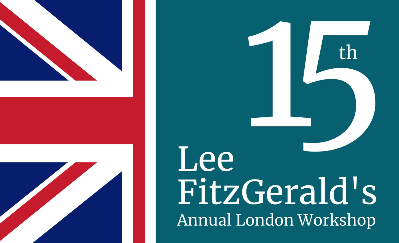
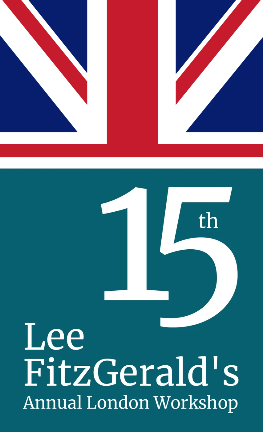
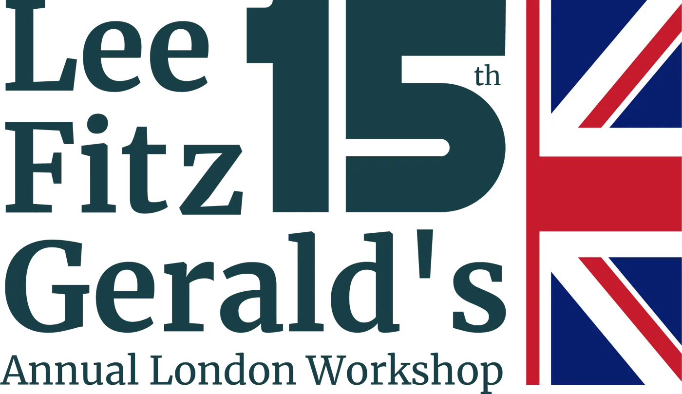
The primary lockup: the “15th” milestone, the Union Jack, and the workshop name, in the event’s deep-green and heritage palette.
Elegance, tradition and renewal
A milestone year needed an identity that felt both established and forward-looking. We anchored the palette in English heritage and the tranquil landscapes of Kensington Gardens, deep greens for stability and growth, warm golden and ochre tones for achievement and celebration, balanced by calming blues and sophisticated neutrals for trust and accessibility.
For the visual language, we looked to the venue. The architectural patterns of the London Marriott Hotel Kensington, its curved lines and repeated structures, became a pattern system of interconnected paths, a quiet metaphor for connection, balance and progress in recovery. The result bridges past and present, exactly the workshop’s own mission.

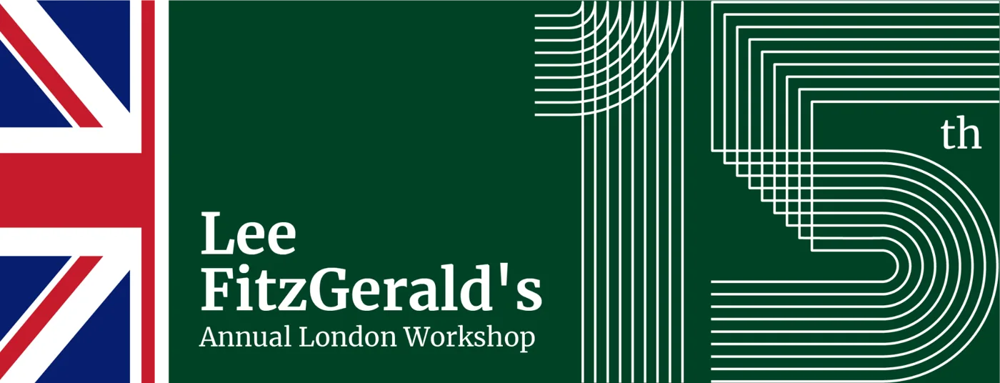
The pattern language: architectural line-work resolving into the “15”, interconnected paths standing for progress and connection.
One mark, dressed for every channel
The lockup was engineered to flex: horizontal and vertical formats, and a set of colorways, deep green, navy and teal, so the identity holds up on a banner, a badge, a slide or a social tile without ever losing the milestone “15” or the London cue.
A heritage palette
Deep Kensington green, celebratory gold and ochre, calming blue and refined neutrals, a palette that reads as prestigious and trustworthy at once, and gives the event a cohesive look across every touchpoint.

Curved lines and repeated structures that evoke connection, balance and innovation, honouring the venue while reinforcing the event’s focus on transformative care.Workshop identity rationale, Addiction Marketing Agency
A home for the workshop
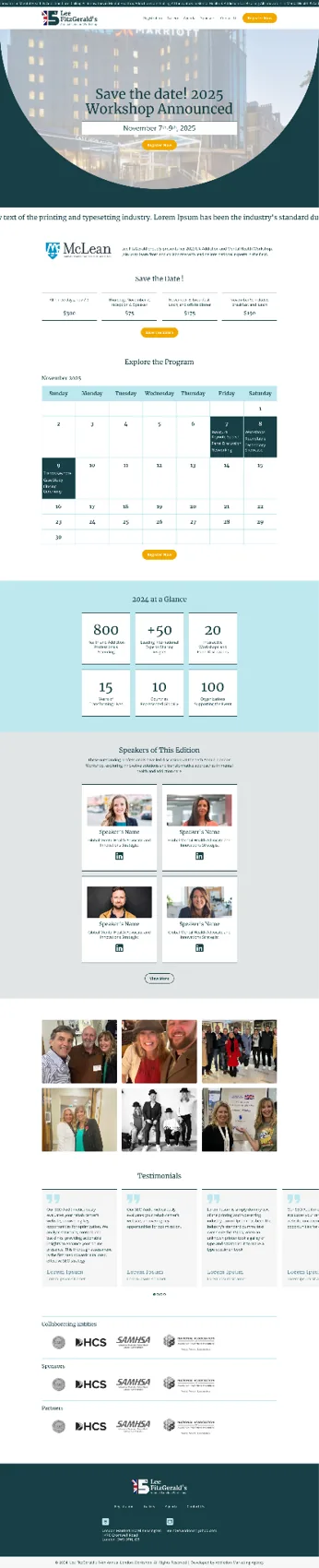
The identity extends into the event website, agenda, speakers and registration, on the same green-and-gold system, so attendees meet one consistent brand from the first ad to the check-in desk.
Announcing the 15th
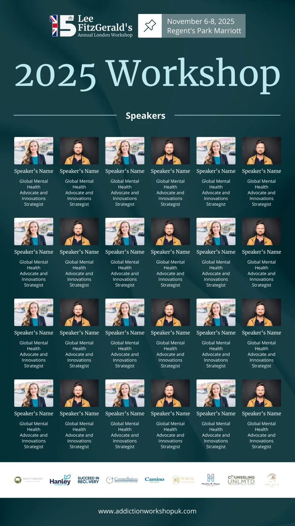
A social campaign carried the milestone to the audience, save-the-date, speaker announcements and venue reveal, each on-brand, each built to be recognized in a crowded feed.
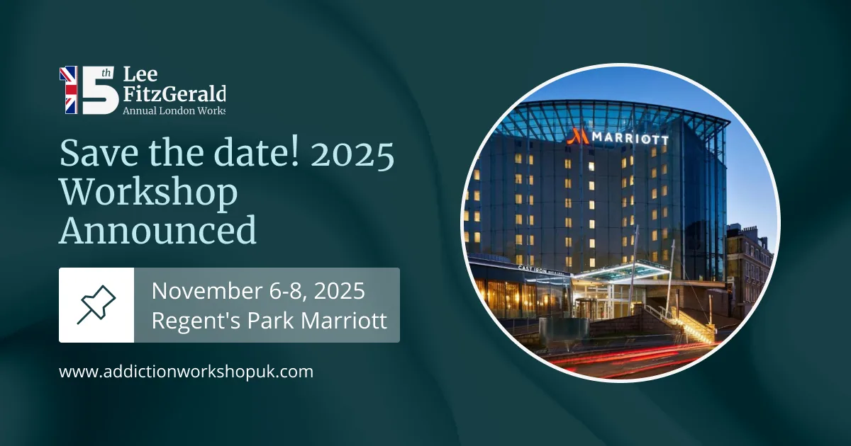
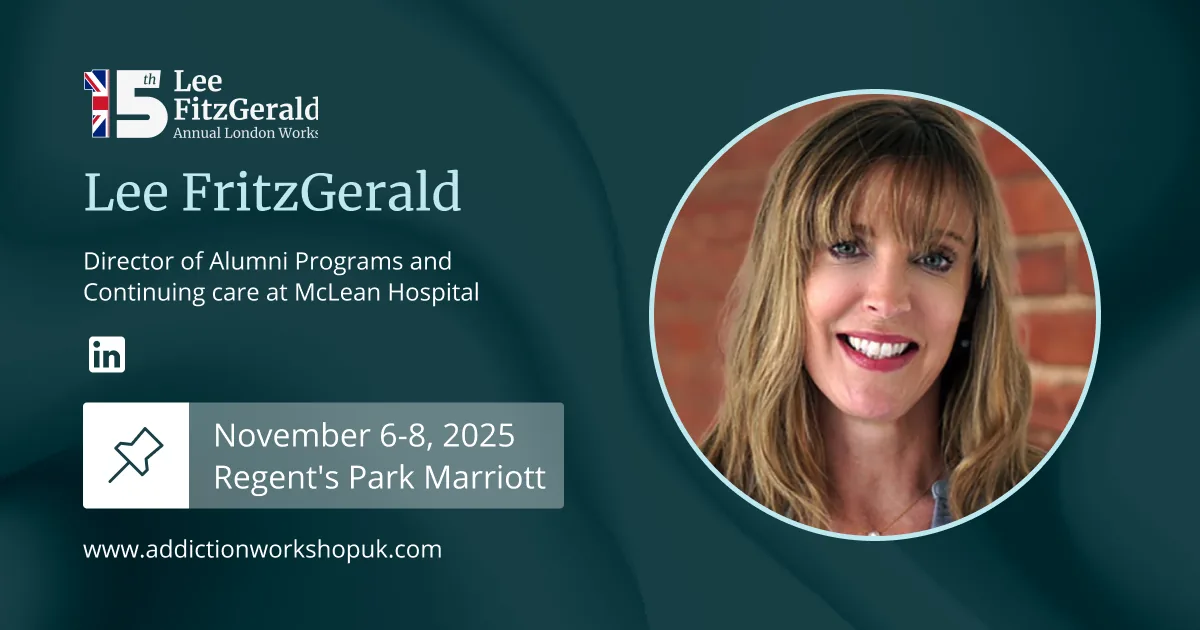
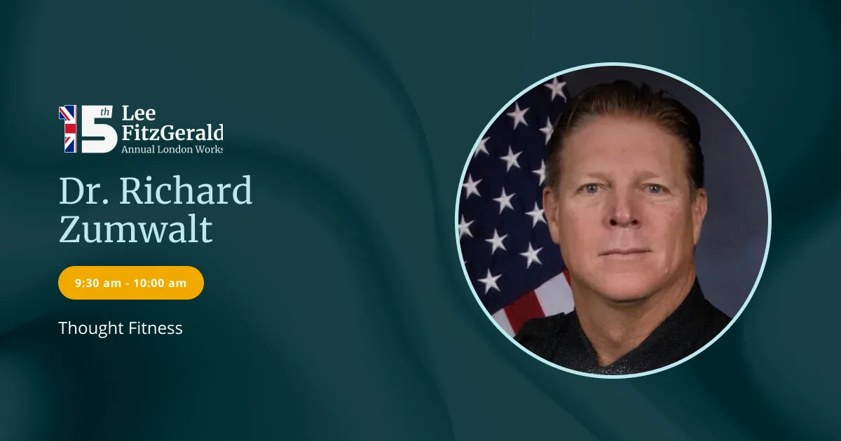
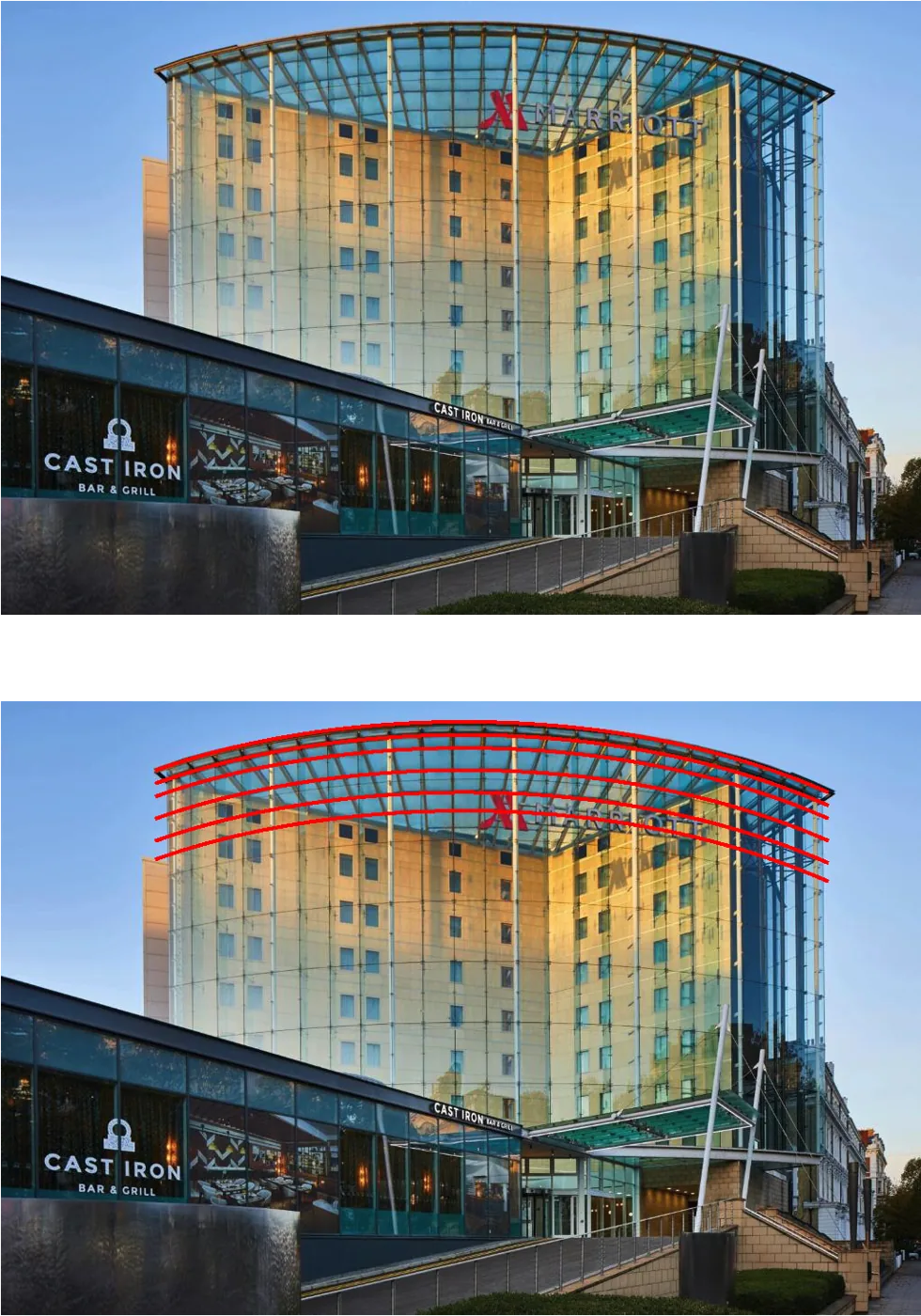
The venue whose architecture shaped the whole system.
An event that looks its age, proudly
The 15th Annual London Workshop launched with a single, confident identity across web, print and social, tradition and renewal in one system, ready to scale year on year as the event grows.
Orchid Recovery Thailand
A boutique “affordable-luxury” sanctuary brand and website for an international rehab in Chiang Mai.
View case study →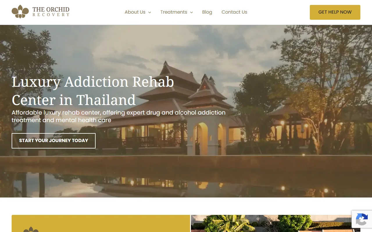
Launching an event or a new location?
From a milestone conference to a brand-new clinic, we build identities that are ready for web, print and social on day one. Let’s talk.
Start a branding conversation →