
Orchid Recovery Thailand
An affordable-luxury sanctuary brand for a rehab in the hills of Chiang Mai.
Orchid Recovery is a boutique private residential clinic in Chiang Mai treating no more than twenty international clients at a time, dual-diagnosis addiction and mental-health care, at a fraction of Western private-rehab pricing.
Addiction Marketing Agency built the brand and website to match that promise: warm, calm and hopeful, an identity that feels like a Thai sanctuary rather than a clinic, and that never leans on stigma or clinical imagery.
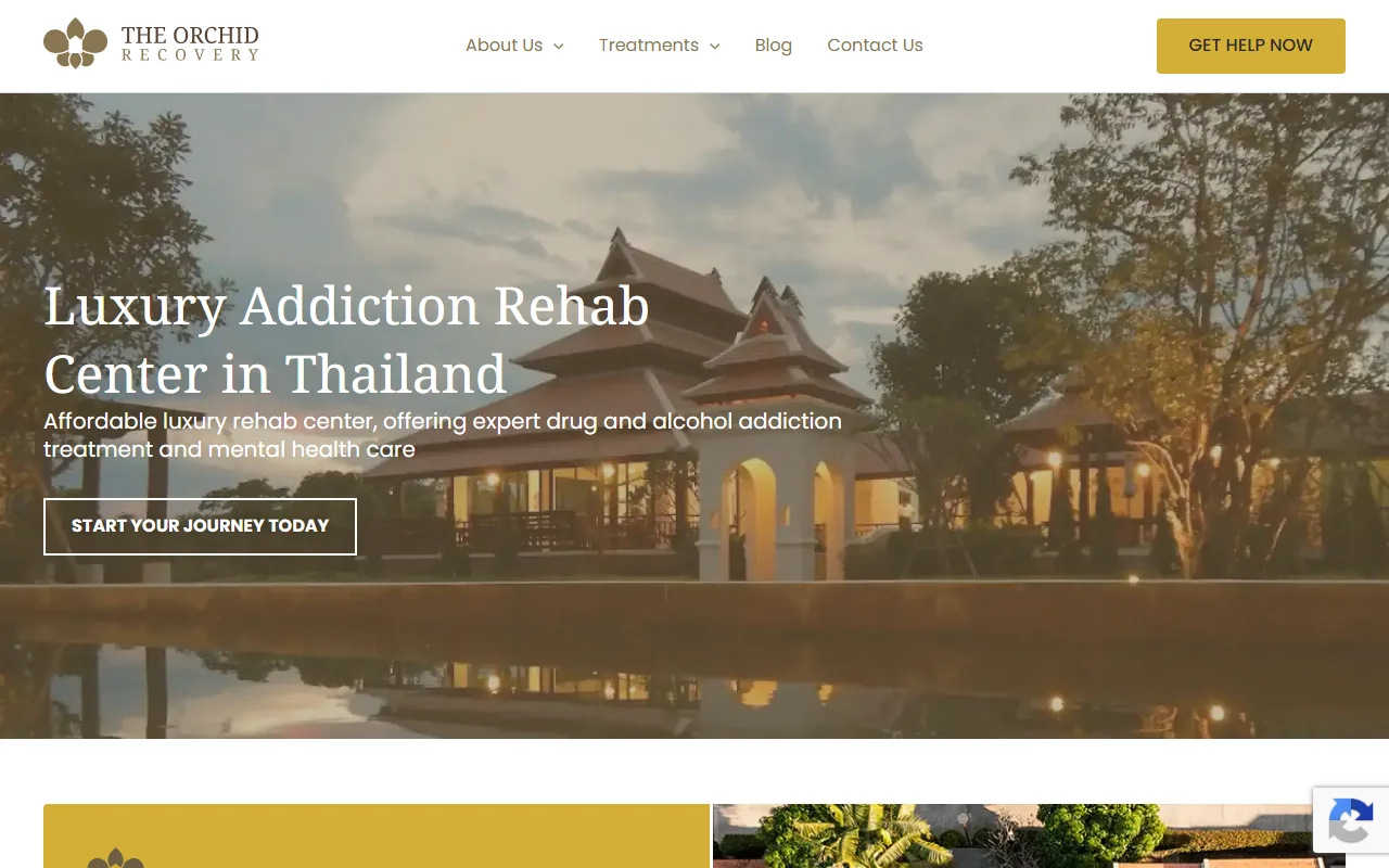
The Orchid identity on the live homepage: a serif wordmark and orchid-petal mark, warm off-white space and golden-hour photography of Chiang Mai.
Sanctuary, not clinic
Orchid competes in a crowded “rehab in Thailand” market where too many brands look either clinical or like a holiday. We positioned Orchid in the space between: affordable luxury, international-grade, evidence-based care in a genuinely restorative setting. Small on purpose, personal by design.
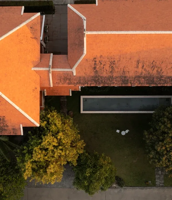
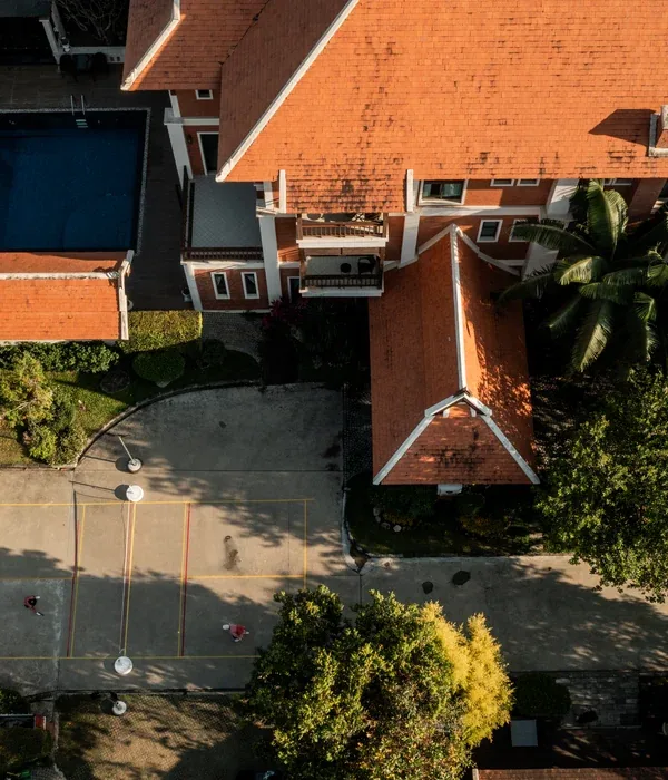
That set clear rules for the identity. The voice is warm, calm and hopeful, speaking to people, not patients, in UK English. The imagery is Chiang Mai’s villa architecture, gardens, pools and nature at golden hour, no clinical imagery, no stigma. The look had to feel like arriving somewhere peaceful.
A quiet, confident mark
The identity centers on a soft orchid-petal cluster beside a two-line serif wordmark. The serif carries heritage and calm; the petal mark gives Orchid an ownable, botanical signature that ties directly to the name and to the Thai setting. The same motif recurs through interior pages as a gentle divider.
The warm off-white is defined in the brand (#F7F4EF); the golden, olive and orchid accents are drawn from the live Orchid identity. Serif headings pair with a clean sans for body.
A brand that speaks to people, not patients, warm, calm and grounding, where the journey to healing feels like it starts the moment you arrive.Orchid Recovery brand voice, Addiction Marketing Agency
The sanctuary, online
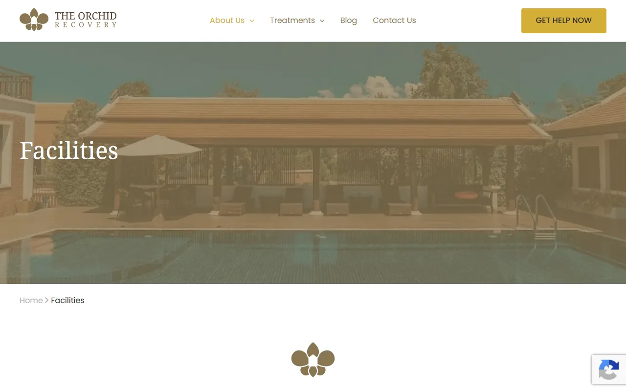
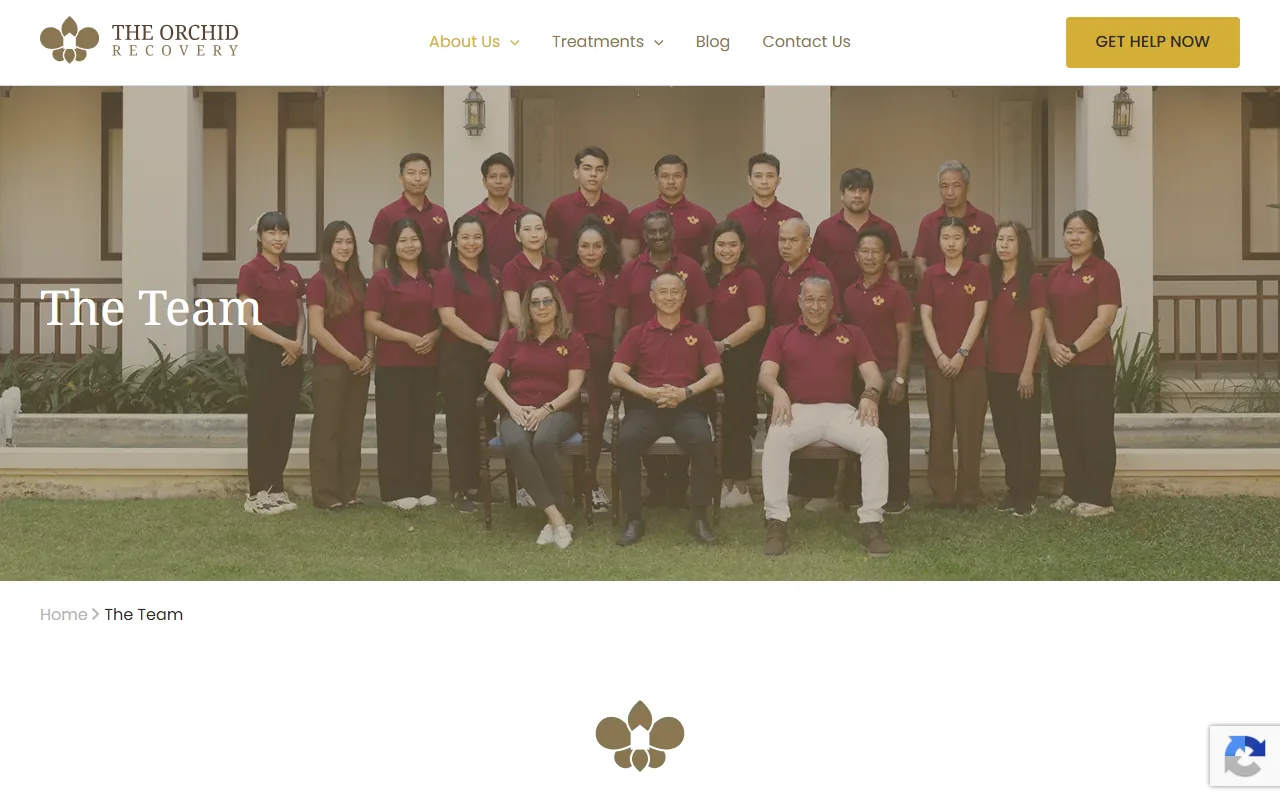
The website carries the identity across the treatment, facilities and team pages, warm space, serif headings, the petal mark and photography that does the emotional work. Every template is built to reassure an international client making a hard decision from far away.
A brand people trust from afar
Orchid launched with a coherent, boutique identity that matches its “affordable luxury” promise, an ownable mark, a warm palette and voice, and a website that turns a distant, difficult decision into a reassuring one.
Steps Together
A calming, grounded brand system and a stronger digital experience for a UK behavioral-health group.
View case study →
Opening a destination rehab?
We build treatment brands and websites that earn trust across borders, then market them ethically, one provider per area. Start with a free brand and web review.
Start a branding conversation →