We rebranded ourselves the way we rebrand our clients: new logo, new system, new site
A marketing agency’s own front door is its strongest portfolio piece. We retired an ageing wordmark and a dated template, then rebuilt everything: the mark, the system, and the site. Here is the before and after, side by side.
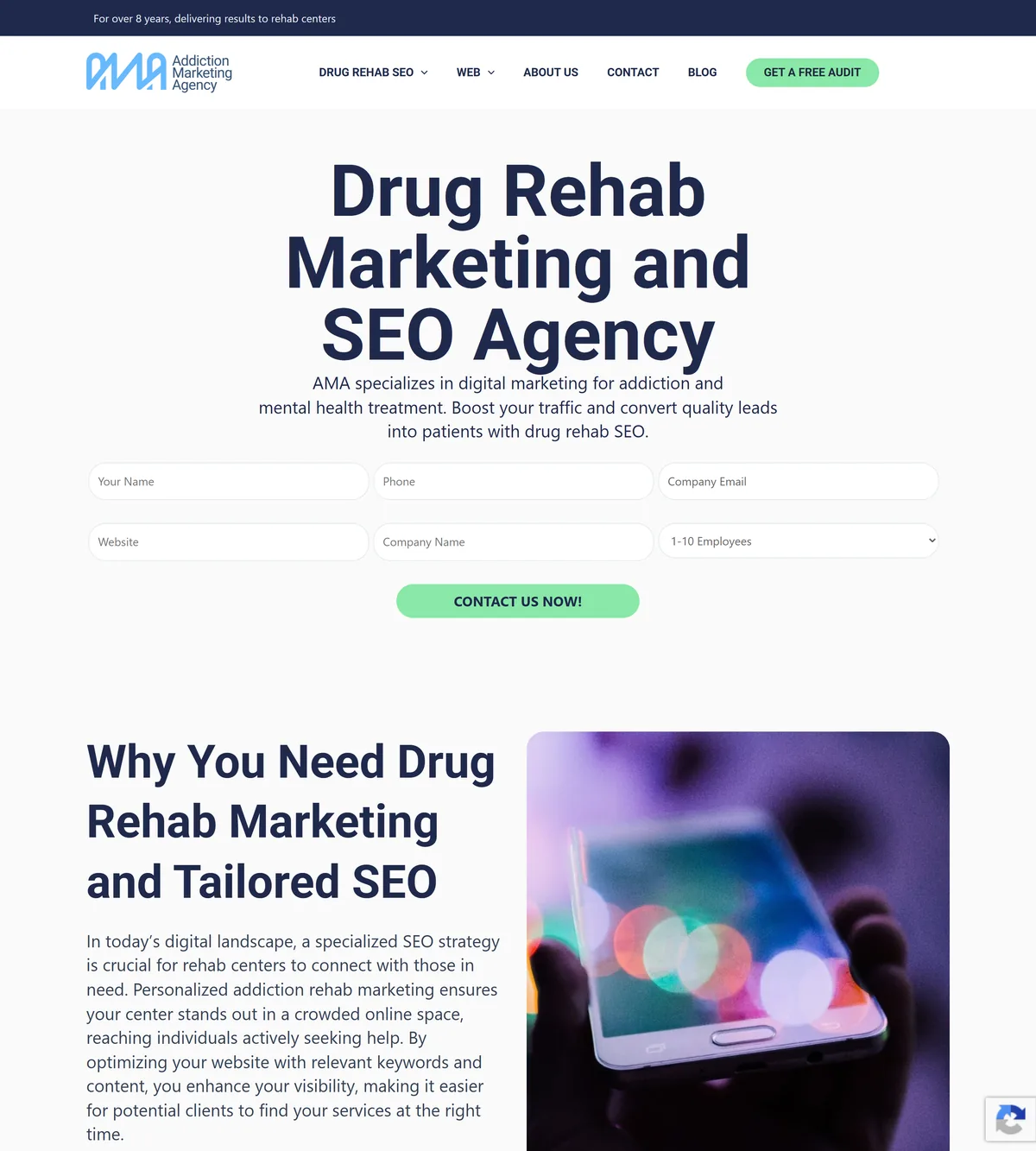
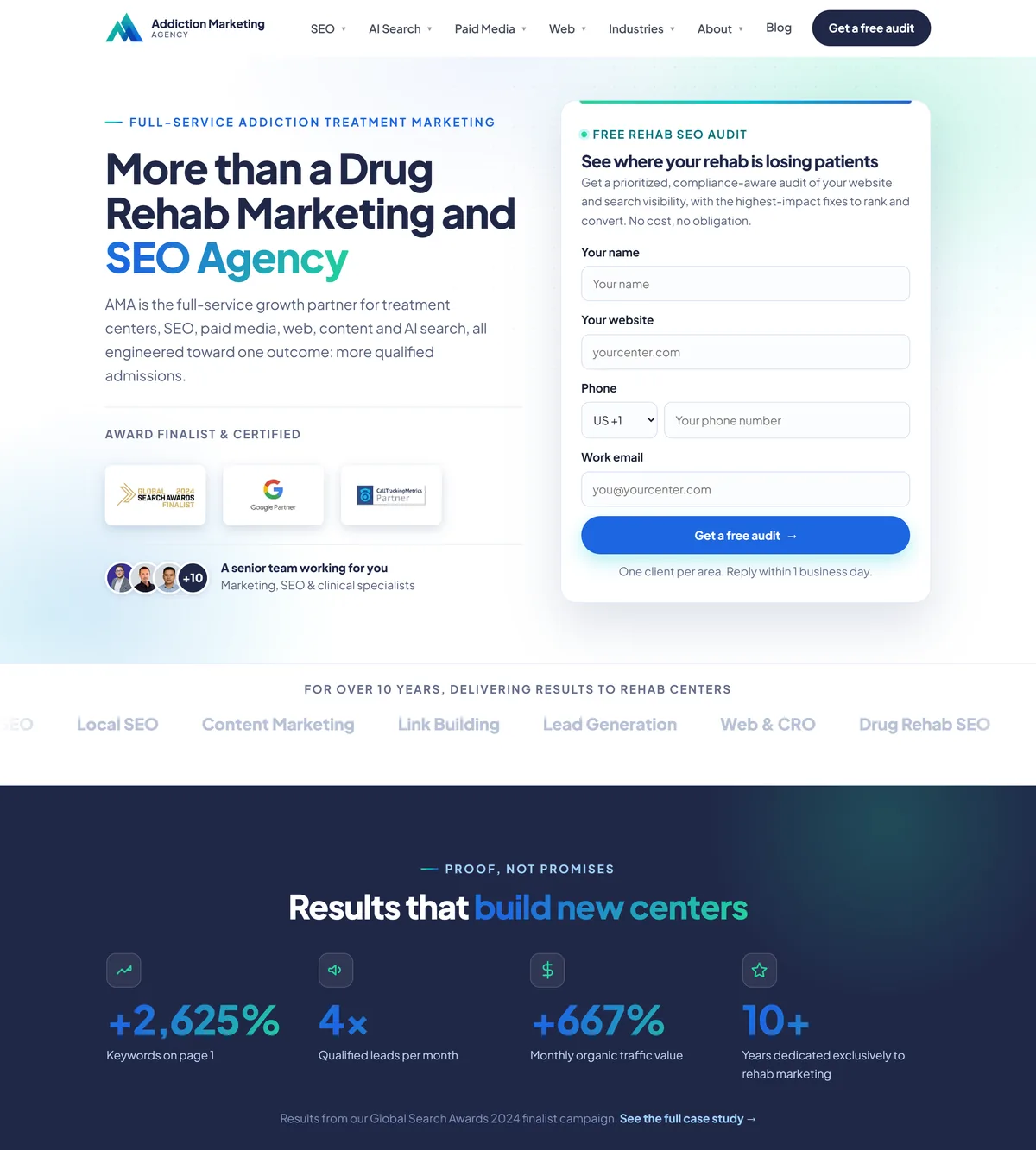
Why we changed the mark, and what the new one means
The old logo was doing the brand no favours. The new one is built to be legible, ownable and meaningful.
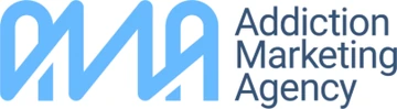
- ×Hard to read. A hand-script “AMA” that blurred at small sizes and was often misread as “DMA.”
- ×No icon. Nothing that could stand alone as a favicon, app icon or social avatar.
- ×Generic. A blue script that could have belonged to any agency. It said nothing about who we are.
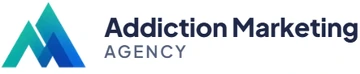
- ✓Legible everywhere. A clean geometric mark plus a wordmark that reads clearly at any size.
- ✓A real icon. The summit mark works alone as a favicon, app icon or avatar, in one color or in the gradient.
- ✓It means something. Two ascending peaks: growth and the upward climb every client wants.

What the mark stands for
Two ascending peaks form a summit, a simple visual for the growth and upward climb a treatment center is after: rising admissions, rising visibility. Look closely and the peaks read as an “M”, and the way the shapes stack quietly nods to AMA.
We didn’t design it to shout the initials, though. The real win is clarity: “Addiction Marketing Agency” now reads clearly and instantly, far more legible than the old hand-script, and the teal-to-blue gradient ties the mark straight into the rest of the system.
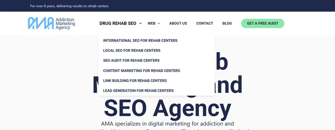
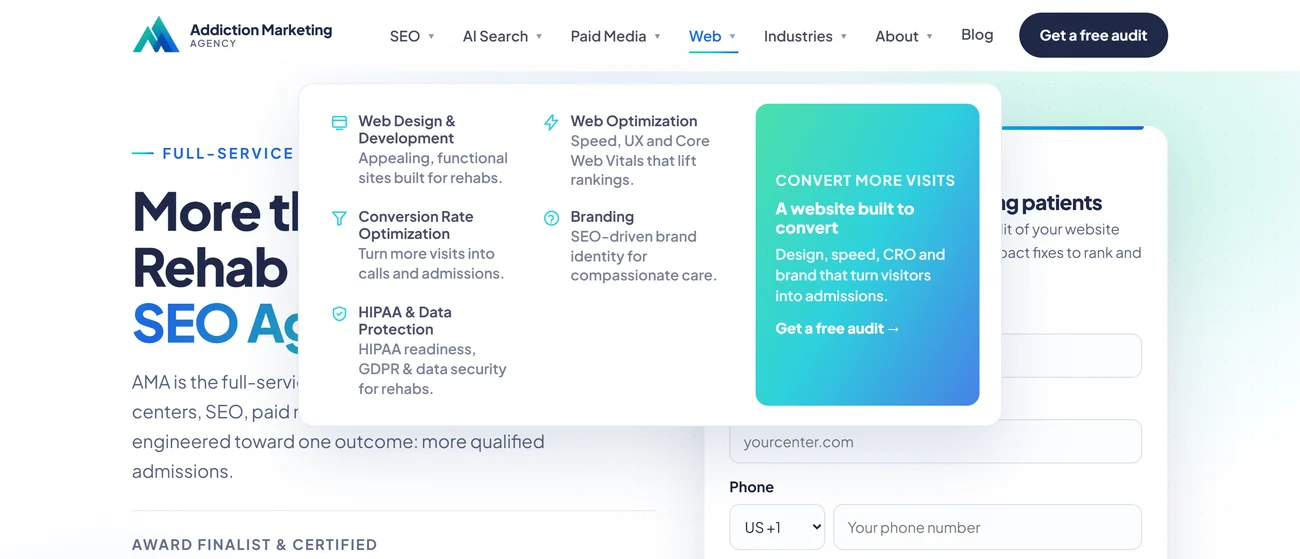
From a plain drop-down to a full mega-menu
The clearest single upgrade. The old menu hid what we do; the new one opens the whole agency at a glance.
Not just a skin, a real design system
The revamp runs on a real system: a defined palette, one typeface, and a component kit that keeps 170+ pages consistent.
Color
Deep, trustworthy navy for structure; a clean teal-to-mint gradient as the single, recognisable accent. Calm and clinical, never loud.
Type & headline accents
Plus Jakarta SansA modern geometric sans for headlines and body alike: friendly, clean and highly legible.
The headline accent is a brand device. Every heading sits in navy with a single teal-to-mint gradient on the two or three words that carry the point. It pulls the eye to the promise, and it ties each page back to the mark and the palette. One accent per headline, never more, so it stays a signal and not decoration.
What actually changed
The old brand & site
- ×Hard-to-read script logo, no usable icon
- ×Generic navy-and-mint template look
- ×Form-heavy hero, message buried
- ×Positioned as a single-service SEO shop
- ×No design system, inconsistent page to page
- ×Weak “contact us” CTA, no clear path to convert
The revamp
- ✓Distinctive summit mark, crisp as a favicon
- ✓Owned palette with a teal-to-mint signature gradient
- ✓Focused hero, one clear next step
- ✓Full-service: SEO, AI search, paid media, web, content
- ✓One consistent design system across every page
- ✓Message-first hero with one clear, value-led CTA
The site is now the portfolio piece
The new brand and structure present every service (SEO, AI search, paid media, web and content) instead of a single line of business.
The old hero opened with a wall of form fields. The new one leads with a clear promise and one obvious next step, so visitors understand what we do and exactly what to do about it. A cleaner path and stronger, value-led calls to action.
When a treatment center asks what a modern brand and site look like, we can point at our own, designed and built end to end by the same team that would do theirs.
Want a brand and site that finally match your work?
We design the mark, the system and the build, then engineer it to be found by Google and AI alike. We work with one treatment provider per area.
Get a free audit →